
Minimalism in tech is like jazz: at first, it looks simple—but every element, every pixel, every curve is intentional. And just like a good jazz riff, when done well, it hits you in ways you didn’t expect.
From early computer interfaces to today’s slick apps and hardware, minimalist design has shaped how we interact with technology, how we feel about it, and ultimately, how we buy it. Let’s explore the evolution, the philosophy, and the products that define minimalist tech.
1. Early Beginnings: Functional Minimalism
In the 1980s and 1990s, minimalism wasn’t an aesthetic choice—it was a necessity. Limited screen resolutions, slow processors, and memory constraints forced designers to strip interfaces down to the essentials.
- Example: The original Macintosh (1984). Its clean desktop, monochrome icons, and simple menus made computing approachable. Minimalism here was about clarity and usability, not style.
- Example: Windows 95 simplified user navigation, moving away from text-heavy command lines toward graphical icons, taskbars, and folders.
Lesson: Minimalism began as functional clarity, where simplicity equaled usability. Users could understand and operate tech without instruction manuals.
2. The Apple Era: Minimalism as Lifestyle
Fast forward to the early 2000s, and minimalism in tech became aspirational. Apple, led by Jonathan Ive and Steve Jobs, transformed minimalism into a philosophy and a lifestyle.
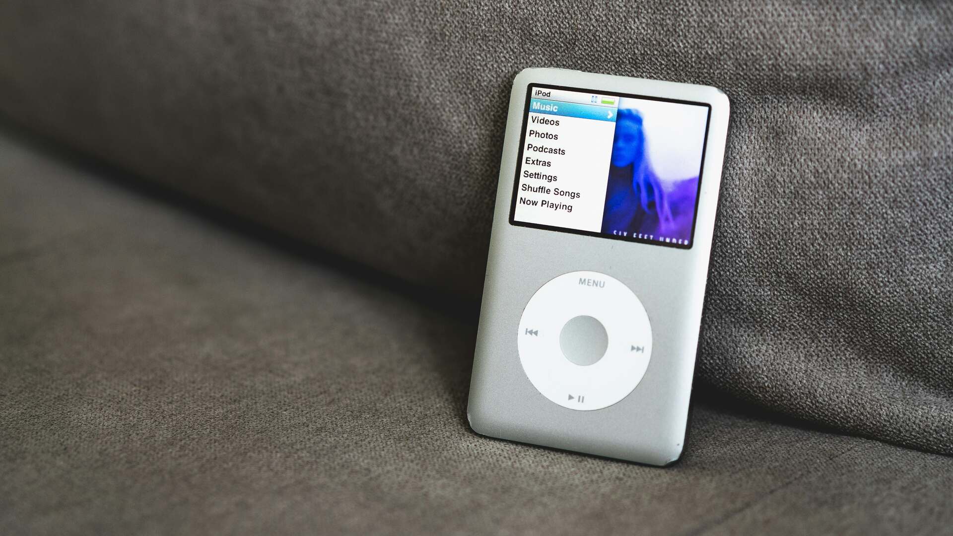
- iPod (2001): The iconic scroll wheel, simple white earbuds, and uncluttered interface made music feel personal and effortless.
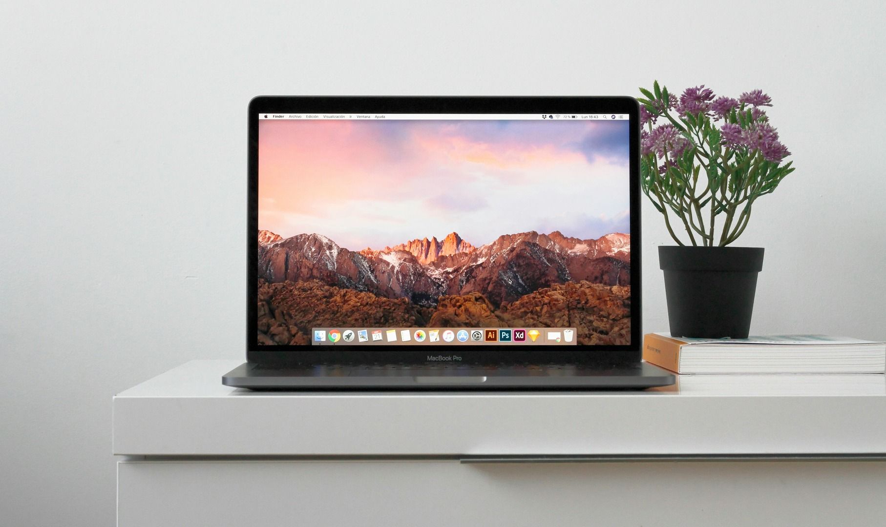
- MacBook & iMac redesigns: Aluminum unibody construction, sparse ports, and clean lines signaled that minimalism was beautiful, premium, and desirable.
Outcome: Minimalism shifted from necessity to emotional appeal. Products weren’t just functional—they conveyed taste, sophistication, and modernity.
Lesson: Minimalism became a tool for branding and emotional connection, proving that less can be far more.
3. Digital Interfaces: Minimalism in Software
With the rise of smartphones and apps, minimalism entered the digital interface world. Designers realized that too much visual noise hurts usability.
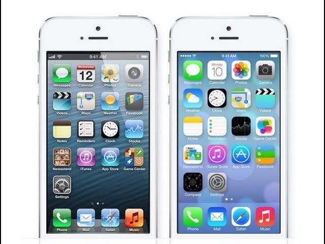
- Flat Design (2013): Microsoft’s Metro UI and Apple’s iOS 7 stripped skeuomorphism, embracing flat icons, bold typography, and whitespace.
- Material Design (2014): Google added subtle depth and motion while keeping interfaces clean. Minimalism became dynamic, not static.
- Example Apps: Instagram, Airbnb, and Slack showcase interfaces that prioritize content and user flow, removing unnecessary buttons or distractions.
Outcome: Minimalism in software improves user focus, reduces cognitive load, and increases adoption rates. Users interact faster, remember interfaces better, and feel less overwhelmed.
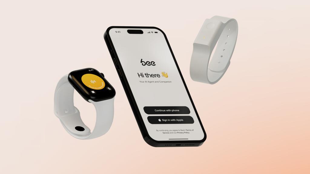
4. Hardware Minimalism Today
Modern tech products embrace minimalism not just in visuals but in physical interaction:
- Smartphones: iPhone, Pixel, and Galaxy devices feature minimal buttons, edge-to-edge screens, and seamless gestures.
- Wearables: Apple Watch and Fitbit reduce complications to essential metrics, letting users focus on health, not clutter.
- IoT Devices: Google Nest, Amazon Echo, and Sonos speakers hide complexity behind simple forms, often blending into home environments.
Outcome: Minimalism creates timelessness and accessibility, making tech less intimidating while emphasizing function.
Lesson: Physical minimalism supports intuitive use and longevity. Products age gracefully when their design is uncluttered.
5. The Philosophy Behind Minimalism
Minimalism in tech isn’t just a style—it’s a mindset:
- Clarity: Every element serves a purpose.
- Focus: Reduce distractions for the user.
- Elegance: Beauty arises from restraint, not decoration.
- Sustainability: Simpler designs often mean less material, less complexity, and longer lifespan.
Designers now blend minimalism with personalization and accessibility, ensuring it’s not just about aesthetics but enhanced human experience.
6. The Future: Minimalism Meets AI & Adaptive Tech
As AI and adaptive interfaces grow:
- Products may dynamically change interface elements, showing only what’s relevant.
- Minimalism will coexist with hyper-personalization, where the interface feels simple for each individual user.
- Voice, gestures, and ambient computing may push minimalism further, often hiding the interface entirely.
Takeaway: Minimalism in tech is evolving from static simplicity to dynamic intelligence. The core principle remains: do more with less, without losing the human touch.
Conclusion: Minimalism as Human-Centered Design
From early Mac desktops to AI-driven adaptive interfaces, minimalist design in tech has evolved from practical necessity to emotional, cognitive, and aesthetic strategy. It’s not just about “looking clean”—it’s about creating products that feel intuitive, elegant, and empowering.
If you’re designing a product today, the lesson is simple: every detail matters, every extra element matters more, and simplicity isn’t subtraction—it’s strategy in disguise.